Motivation
For my entire life, I've been really interested in simulation-type games. As a kid, I remember playing life/space/geography simulators to waste time. For much of the recent past, this interest has shifted towards predictive modeling: I oftentimes question why changing the parameter of XYZ affects the outcome of XYZ.
As an Applied Mathematics student, I've realized that predictions can often be modeled through probability and machine learning — two areas I want to pursue further. I'm genuinely interested in the math behind these subjects (I know, the two aren't entirely orthogonal).
Now you might ask, what does this have to do with politics, specifically elections?
It's a long story, but TLDR, I've been keeping up with politics for the last couple years (as of writing this, Trump is about to give a primetime address in six hours about "free and fair" elections). More recently, I've been seeing predictions on the midterm elections and the 2028 election; to pass time over the last weeks, I've been making crazy predictions for the 2028 elections, despite there not being official tickets.
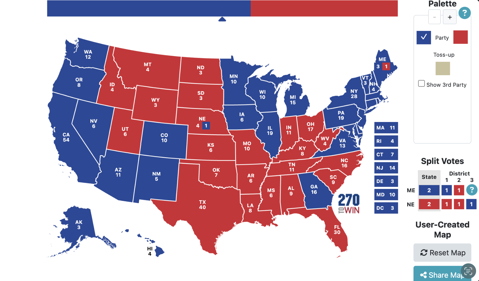
So, I thought it would be interesting to make my own prediction map using some machine learning techniques I've been learning.
How It Works
ElectMap breaks the forecast into four separate layers: each one builds on the last.
Data Pipeline
I first started with raw historical House results going back to 2010 from the MIT Election Lab; anything before then reflects a different political environment. This data was messy, as there was a lot of different district numbering across redistricting cycles, missing incumbency info, inconsistent state abbreviations, so I had to end up doing a lot of cleaning.
I then merged it with the Cook Political Report's Partisan Voting Index (a measure of how red or blue a district leans by nature), macroeconomic indicators from the Federal Reserve (GDP/unemployment), and a flag for districts that were redrawn after the 2020 Census. The end result is one clean table, one row per district per election year, 2010–2022, with every feature the model needs. This step was incredibly boring but it was essential.
Layer 1: Fundamentals Model
The fundamentals model answers a simple question: what does history alone tell us about each district, before a single poll is conducted? It's trained on House election results from 2010 to 2022: six election cycles, 435 districts each, with nine features per row. The training algorithm is XGBoost, which builds hundreds of decision trees sequentially where each tree self-corrects the error of the one before it. The result is a model that learns which combinations of features best predict Democrat vote share in a given district in a given year.
Every row in the training data represents a district in one election year. Here's what goes in:
- Partisan Lean (Cook PVI)
- Prior Democrat Vote Share: [0, 1], where the larger values represent higher concentrations of Democrat votes.
- Incumbency: {-1, 0, 1}, where -1 is a Republican, 0 is an open seat, and 1 is a Democrat.
- Presidential Approval during midterm elections.
- GDP Growth (Q2)
- GDP Log Growth
- Unemployment (October)
- Midterm Year Penalty: {0, 1}, where 0 is a presidential election and 1 is a midterm election.
- Redistricted Flag: {0, 1}, where 0 means the district hasn't been redistricted after 2020, and 1 otherwise.
SHAP Values
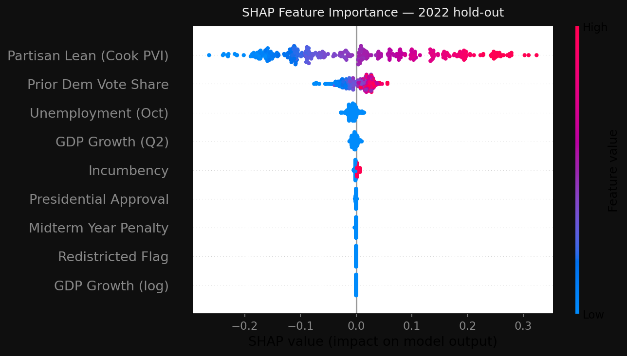
Once the model is trained, I use SHAP (SHapley Additive exPlanations) to explain every individual prediction. SHAP comes from cooperative game theory, and it basically asks: for this district, how much did each feature contribute to pushing the prediction above or below the baseline? The contributions add up exactly to the prediction, so it's not an approximation.
For most of the districts, Cook PVI and prior vote shares dominate, which makes a lot of sense, since district-level political geography is the strongest signal. For more competitive districts, incumbency and presidential approval have a more obvious effect.
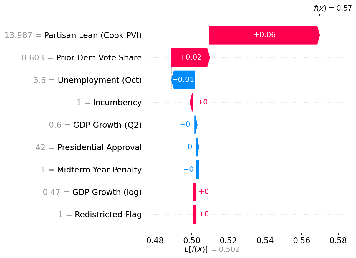
When you click any district on the map, the sidebar shows the top three SHAP factors for that specific prediction: which features pushed it toward Democrats, which pushed it toward Republicans, and by how much.
Converting Vote Share to Win Probability
The model outputs a predicted Democrat vote share; however, a single number doesn't show how uncertain that prediction is. To convert it to a win probability, I model the uncertainty as a normal distribution centered on the prediction with a standard deviation of 5.2 percentage points, derived from historical forecast errors across the backtest cycles (see that section for more information).
The win probability is then the area under that curve, above 50%, which is the probability that the true outcome lands on the Democrat side of the majority threshold. Mathematically: Φ((ŷ - 0.5) / σ), where ŷ is the predicted vote share, σ = 0.052, and Φ is the standard normal CDF. A prediction of 52.5% becomes roughly a 73% win probability.
Layer 2: Event Impact Model Coming Soon
Layer 3: Bayesian Poll Aggregator Coming Soon
Layer 4: Election Simulator Coming Soon
Data Sources
Used in Version 0.1
- MIT Election Lab — historical U.S. House election results going back to 1976. The primary source for all vote share training data from 2010–2022.
- Cook Political Report PVI (119th Congress) — partisan lean per congressional district, recalculated after the 2020 Census redistricting. The single most predictive feature in the fundamentals model.
- FRED (Federal Reserve Economic Data) — macroeconomic indicators including GDP growth (Q2) and unemployment (October), pulled via the FRED API and auto-refreshed.
- FEC Candidate Filings + Ballotpedia — used to determine 2026 incumbency status for all 435 districts: who is running, who is retiring, and which seats are open.
- Redistricting Data Hub — identifies which districts were redrawn after the 2020 Census, used to flag cases where the prior vote share is not a reliable signal.
- U.S. Census Bureau TIGER/Line (GENZ2024) — congressional district boundary shapefiles for the 119th Congress, including the five states with court-ordered redistricting for the 2024 cycle. Used to render the Leaflet map.
Coming in Later Versions
- FiveThirtyEight polling archive — historical House and generic ballot polls for 2018, 2020, and 2022, used to validate the Bayesian poll aggregator and compare forecast accuracy.
- CCES (Cooperative Congressional Election Study) — a 60,000-respondent voter survey that includes validated vote history, used to train the likely-voter logistic regression model.
- GDELT + NewsAPI — event ingestion sources for the event impact model. GDELT provides a global database of news events; NewsAPI supplements with headline data to classify political events and estimate their effect on polling.
Backtest Results
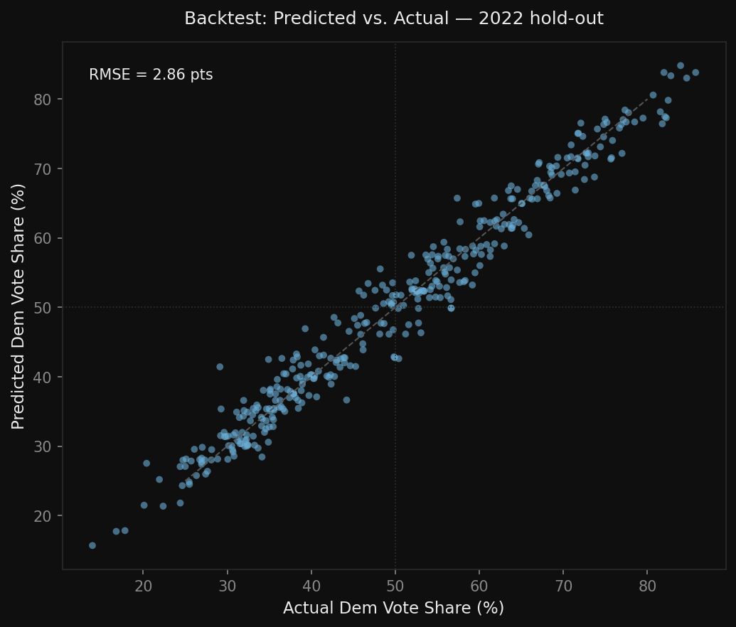
To test whether or not the model is accurate, I ran three separate backtests rather than just checking how well it fit its own training data. In each one, I trained on everything up to a certain cycle and then predicted the next one without ever letting the model see the results. I trained on 2010–2016 to predict 2018, 2010–2018 to predict 2020, and finally 2010–2020 to predict 2022. The comparison benchmark is FiveThirtyEight's published district-level forecasts for each of those cycles.
I used two metrics: RMSE (root mean squared error) measures the average miss in percentage points on predicted Democrat vote share, the lower the better. Brier Score measures how well the win probabilities are: a model that says 70% wherever it should say 70% will have a lower Brier Score than one that leans towards 50%, even if the RMSE is similar.
| Cycle | Our RMSE | 538 RMSE | Our Brier | 538 Brier | Districts |
|---|---|---|---|---|---|
| 2018 | 6.25 pp | 3.34 pp | 0.0915 | 0.0295 | 393 |
| 2020 | 3.82 pp | 3.39 pp | 0.0323 | 0.0344 | 407 |
| 2022 | 5.20 pp | 3.51 pp | 0.0600 | 0.0338 | 400 |
2018 had the worst backtest results. 2018 was a huge blue wave election: Democrats massively outperformed and gained 41 seats. A fundamentals-only model trained on 2010–2016 data has no way of predicting that shift.
2020 had the most interesting results. The RMSE is actually pretty close (3.82 vs 3.39), and my Brier Score was better than 538's (0.0323 vs 0.0344). This is likely coincidental rather than proof that the model is better.
2022 gave a more typical gap: RMSE of 5.20 vs 3.51 for 538. I think the redistricted districts are a real issue here: the model leans heavily on prior vote share as a feature, and for seats that were redrawn after 2020, that prior signal is from a geographically different constituency.
The best takeaway from the backtest results is that the historical model performs well enough in stable political environments to be a useful prior, but it is not a standalone forecast.
2026 Midterm Prediction Results
These are the model's current projections for the 2026 House elections, based on the fundamentals only model. The model projects Democrats to win 228 seats and Republicans to win 140, with 67 districts rated as toss-ups. The majority threshold is 218 seats. Breaking it down: 212 Safe D, 16 Lean D, 67 Toss-up, 49 Lean R, 91 Safe R.
Known Limitations
The most obvious issue with the current model is that the 2026 projections are skewing unusually Democratic. The mean predicted Democrat vote share across all 435 districts is 54.0%, which is higher than any election cycle in the training data, including the 2018 blue wave. The chart below shows this clearly.
The most likely explanation is that the Cook PVI values the model uses as its strongest feature are based on the 2020 presidential results, which were a particularly good year for Democrats. When the model extrapolates from those PVI numbers into 2026, it picks up that Democratic baseline and amplifies it.
A related issue is the 2025–2026 redistricting cycle. Several states redrew their congressional maps after court rulings, and some Republican-controlled legislatures pushed through new gerrymanders that the model's training data does not reflect at all. The model was trained on pre-redistricting district compositions, and in states where maps changed significantly, the prior vote share and Cook PVI values the model is reading are from districts that no longer exist in the same form. This makes the predictions in those states particularly unreliable.
Both of these issues will partially resolve in later versions: the Bayesian poll aggregator will pull the prediction toward actual polling rather than relying solely on structural features, and the Cook PVI values can be updated to reflect the new district lines as better data becomes available.